A portal of Baycare hospitals for couples navigating pre- and post-pregnancy.
BayCare Health System offers a patient portal called myBayCare, which provides online access to medical records and other health information, including services for maternity and pregnancy. Expectant parents can use the portal to pre-register for delivery, access educational resources, and find information about maternity classes and support groups.
The Problem: Baycare had a lot of disparate information regarding pregnancy spread over many different sites and web pages.
The solution: Bring all this information together into one, cohesive experience. As the couple progressed in their pregnancy, the app would evolve and progress with them.
- Gathering all the disparate pieces of information Many different people in many different departments had unique bits of information
Solution: Gather a representative group of subject matter experts and conduct a Participatory design session
- A ‘whole is greater than the sum of its parts’ revelation – stakeholders were able to see how bringing together all this information created an informative end-to-end experience for their users
- A prototype (POC) that stakeholders were able to share with their teams to get buy-in.
Users: Expectant and new mothers and fathers.
- 2-day Participatory design sessions
- Journey Mapping
- Wireframes, Comps, Prototypes
- Iterative design: discovery, design/build, and review
- Sr. Product Designer & Researcher (Me)
- 1 Project Lead
- 1 Graphic Designer
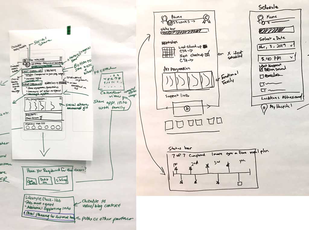
Design Studio Sketches
- Starting with 16 participants, we divided the larger group into 4 smaller ‘design teams’
- Since everyone from different departments we started with an icebreaker exercise in order for them to quickly get to know each other in a fun way
- Next, we had teams brainstorm features they would like to include in their app, write them on stickies, and post them to the whiteboard
- Then, we affinitized the stickies and discussed them
- Each team then went to separate areas of the room where we had large pieces of paper taped to the walls.
- The groups sketched out an initial design
- After that the groups walked around the room to view the other teams designs
- Each team regrouped for a second round of design work and then presented their design to the larger group along with a short Q and A
- The larger group then discussed the merits of each design
User Scenarios
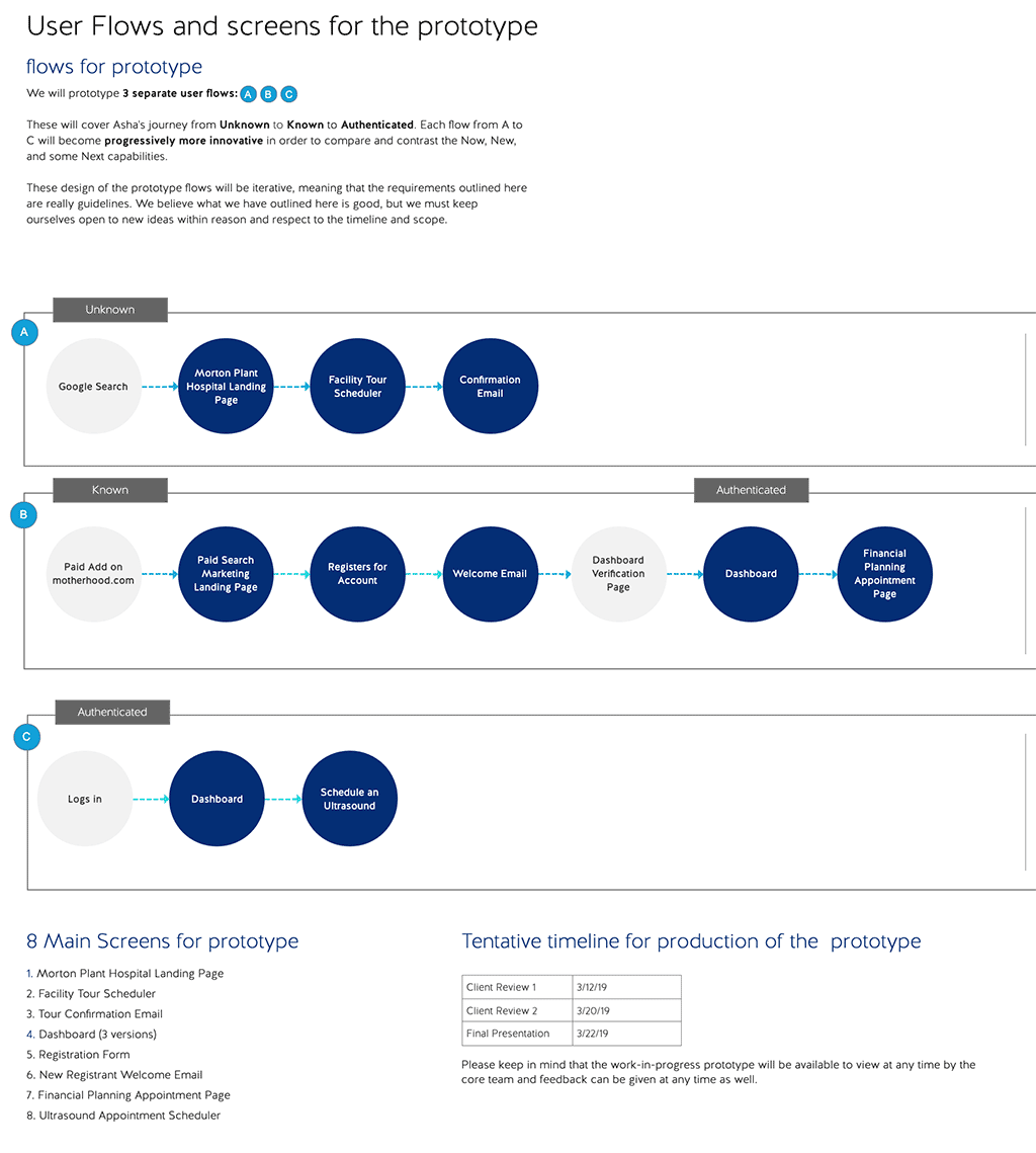
The teams designs were based on 3 separate flows determined on day 1
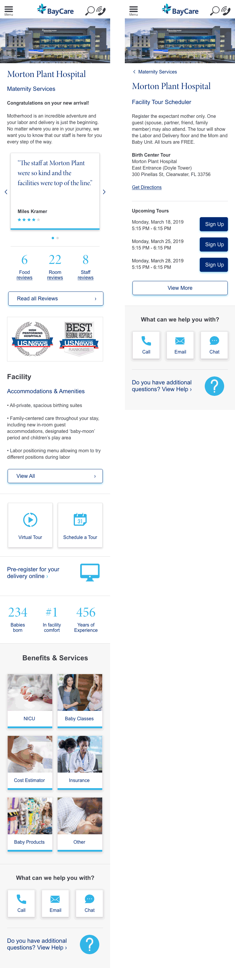
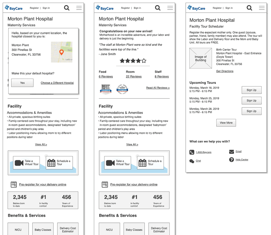
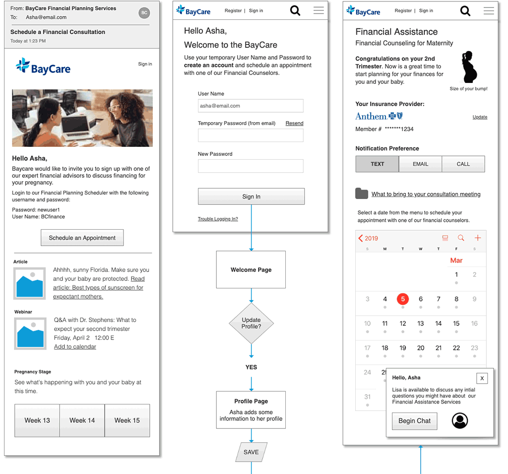
Wireframes for Mobile Pre-login
The decided to take a mobile-first approach to the design
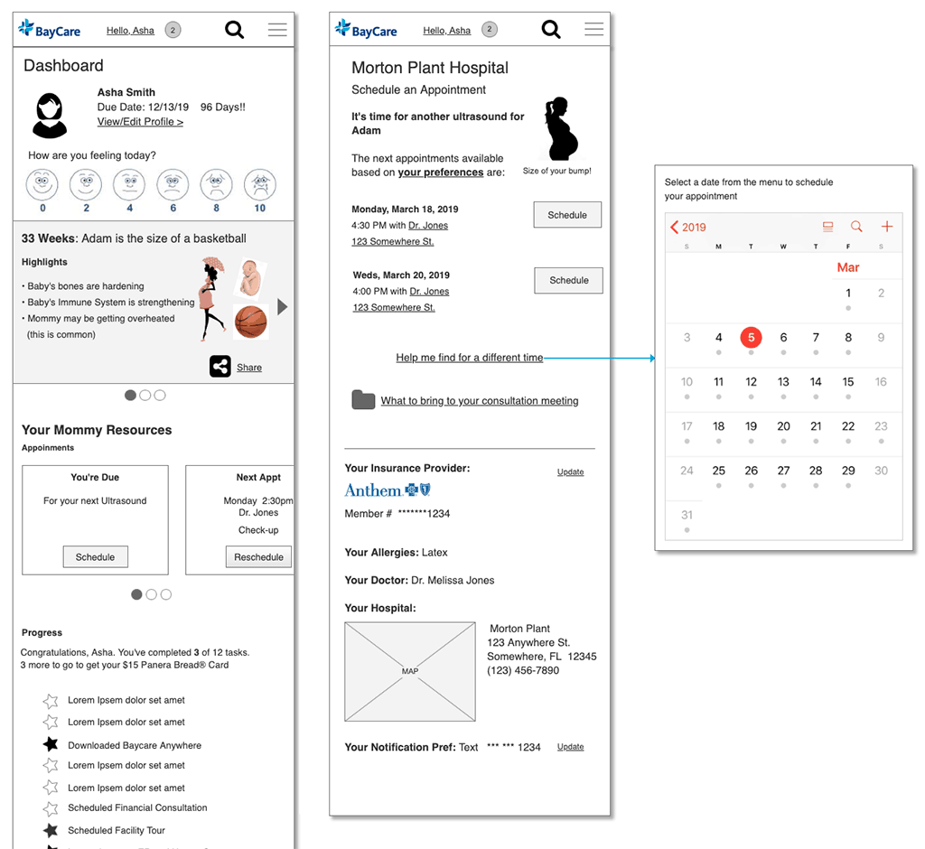
Wireframes for Mobile Post-login
Wireframes for Mobile Post-login (cont’d)
Mock-ups for Mobile